PHOTOSHOP
Introduction to the Photoshop Environment
| intro-to-ps_environment.pdf |
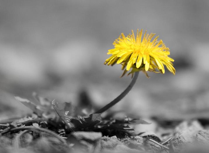
SPOT COLOUR PROJECT
| spot_colour_project.pdf |
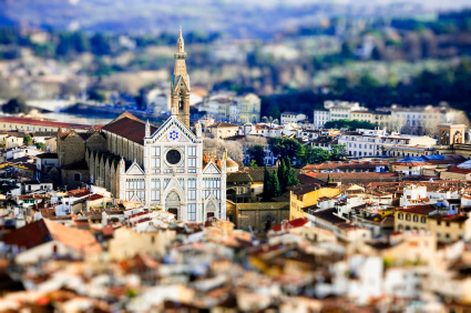
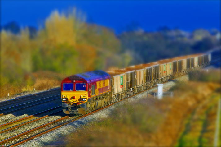
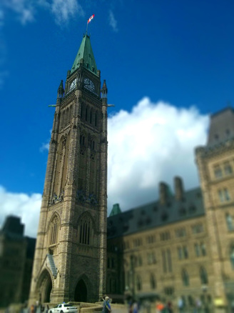
TILT SHIFT PROJECT
| tilt_shift_project-assignment-sheet.pdf |

|
|
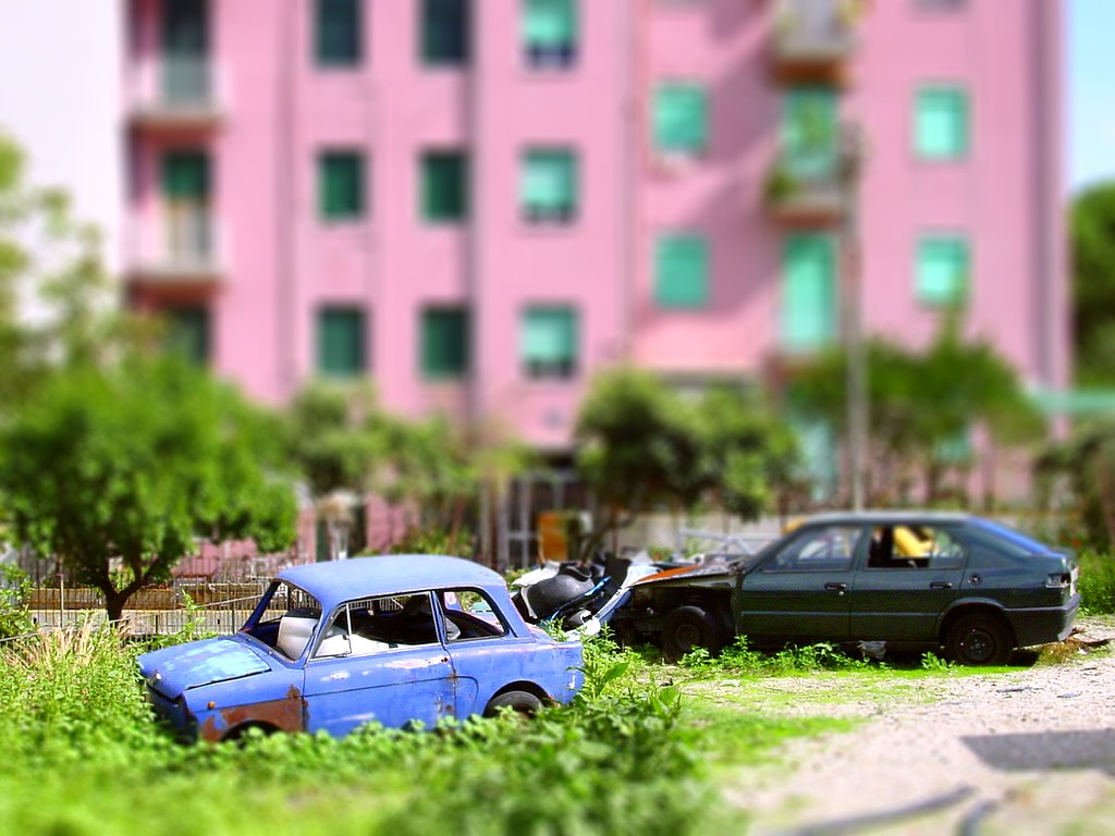
To try it out and see what a photo will look like with tilt shift applied a quick way to see it is using www.tiltshiftmaker.com
Keep in mind that this website does not allow you to control the outcome of your image as much as Photoshop does and will often result in a choppy image. But, it's a good start point to try it out and get a feel for the look of a tilt shift photo. Your result in photoshop will be much better! If you really play around with the settings on the website you can still get some great images very quickly! Try it out!
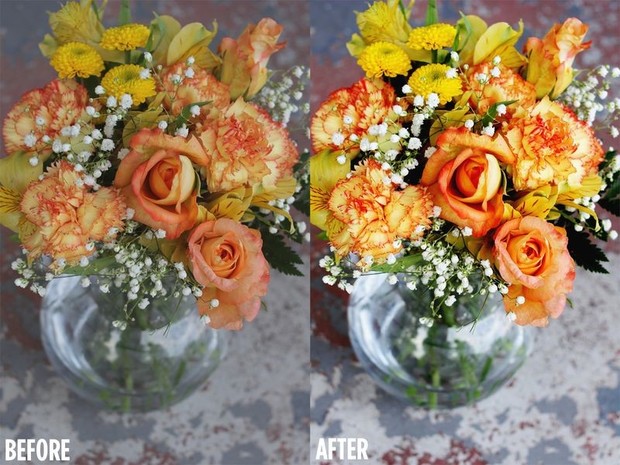
ADJUSTING COLOUR FOR VIVID HUES
|
| ||
|
What Are Channels Good For?
Red Channel - Contrast The red channel is often called the Contrast Channel. This channel is usually the brightest channel with the most contrast. You can often use this channel for making a selection. Green Channel - Detail The green channel is often called the Detail Channel. This channel is usually looks more like a B&W version of the photograph than the other channels. That's because this channel usually has the most image information. The human visual system is most sensitive to green. Therefore, there are twice as many green photosites on a camera sensor, compared to red and blue photosites. This channel is often used when making a color to B&W conversion. Blue Channel - Noise The blue channel is often called the Noise Channel. This channel is usually the darkest, and contains the most noise. Thus, noise reduction techniques are often applied to this channel. |
Compare Histograms
Create a separate Levels adjustment layer above the Background, Luminosity, and Color layers. Once you've created all three Levels adjustment layers, double click on the Levels thumbnail in each layer to look at the layer's histogram. Be sure to deselect the eye icon of the layers that you're not examining. You want to look at the histogram for each layer, not a histogram that's a mixture of several layers. Also, change the Channel box in the Levels window from RGB/Master to Red, Green, and Blue. |
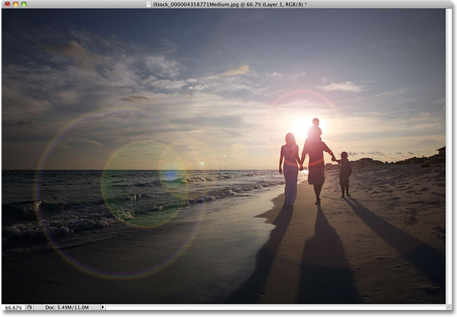
Lens Flare - Photoshop
making it subtle & realistic/beleivable
|
| ||
