COLOUR
Colour is an element of art.
Artists look at colour in terms of 3 key properties: hue, value and intensity.
HUE: refers to the name of the colour (eg. red, violet or yellow-green)
VALUE: The lightness or darkness of a hue. Tints and shades refer to changes in value.
INTENSITY: The strength or vividness of a hue, or the brightness or dullness of a hue.
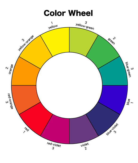
The Colour Wheel
The color wheel or color circle is the basic tool for combining colors. The first circular color
diagram was designed by Sir Isaac Newton in 1666.
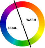
The color wheel can be divided into warm and cool colors or into primary, secondary and tertiary (or intermediate) colours.
Warm colors are vivid and energetic, they give the impression of action.
Warm colours tend to advance in space.
Cool colors give an impression of calm, and create a soothing impression.
Cool colours ted to recede in a composition.
Primary, Secondary and Tertiary Colors
The three Primary colors are: red, yellow and blue.
These colours are special for 2 reasons.
First they can be used to make all of the other colours on the cholour wheel.
Secondly, they cannot be made by mixing any colours together.
The three secondary colors are: green, orange and purple
These colours are created by mixing two primary colors.
The six tertiary colors are: red-orange, yellow-orange, yellow-green, blue-green, blue-violet, red-violet.
They are created by mixing primary and secondary colors together.
Tints, Shades & Tones
White, black and gray are considered to be neutral.
The color wheel or color circle is the basic tool for combining colors. The first circular color
diagram was designed by Sir Isaac Newton in 1666.
The color wheel can be divided into warm and cool colors or into primary, secondary and tertiary (or intermediate) colours.
Warm colors are vivid and energetic, they give the impression of action.
Warm colours tend to advance in space.
Cool colors give an impression of calm, and create a soothing impression.
Cool colours ted to recede in a composition.
Primary, Secondary and Tertiary Colors
The three Primary colors are: red, yellow and blue.
These colours are special for 2 reasons.
First they can be used to make all of the other colours on the cholour wheel.
Secondly, they cannot be made by mixing any colours together.
The three secondary colors are: green, orange and purple
These colours are created by mixing two primary colors.
The six tertiary colors are: red-orange, yellow-orange, yellow-green, blue-green, blue-violet, red-violet.
They are created by mixing primary and secondary colors together.
Tints, Shades & Tones
White, black and gray are considered to be neutral.
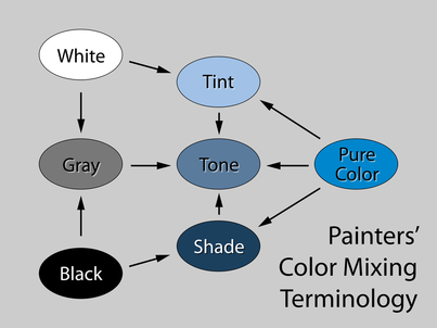
In color theory, a tint is the mixture of a color with white, which increases lightness, and a shade is the mixture of a color with black, which reduces lightness. A tone is produced either by the mixture of a color with gray, or by both tinting and shading.
| colour_theory_-_worksheet.pdf |
Colour Schemes
| colour_schemes.pdf |
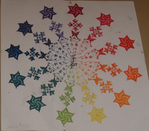
Creative Colour Wheel Project
|
Colour examples from your handouts in class are available to look at if you open the .pdf document below and scroll to the second page.
| ||
